Astro Branding
A brand has an inner structure before it has a name, a logo or a visual system. It has its own way of building, communicating, forming relationships and positioning itself in the world.
Astro Branding is a process of orientation in which this structure is analysed from an astrological and elemental perspective, then translated into decisions about identity, positioning and expression.
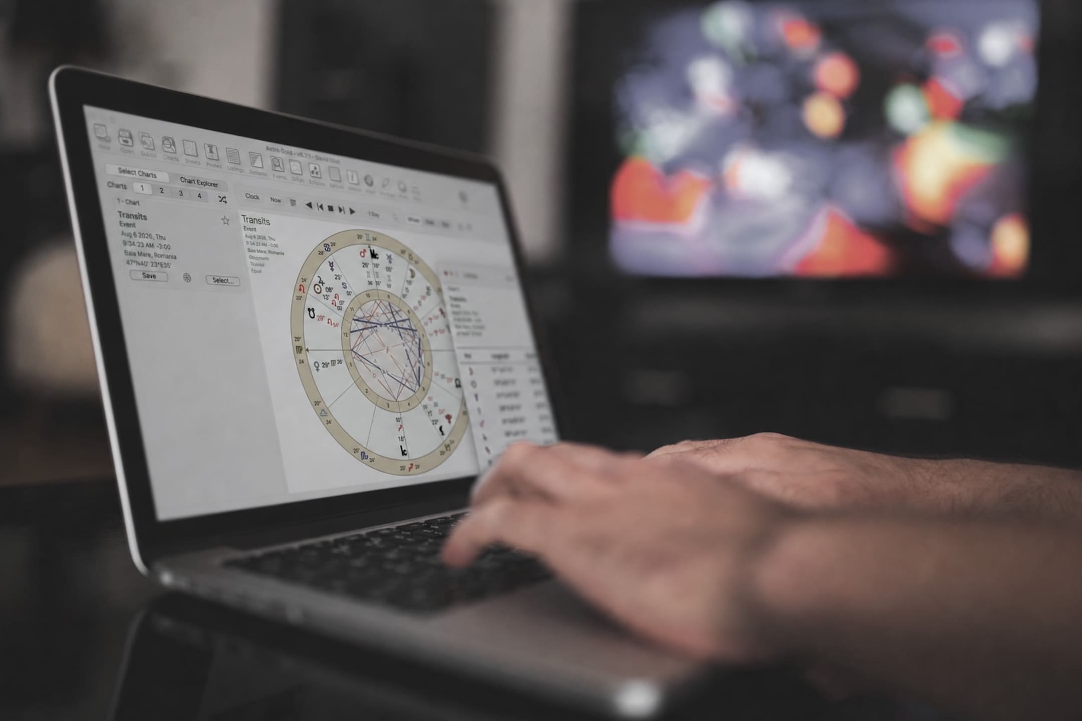
For a personal brand, the starting point is the birth chart of the person building it. For a company, the analysis can bring together the astrological structure of the organisation with that of its founders or the people who shape its direction.
The aim is not to create an exotic identity or one loaded with astrological symbols. Astrology becomes an instrument of observation, used to understand what supports the project, where tensions arise and what form of expression comes naturally to it.
Astro Branding does not replace strategy, market research or design. It gives them a coherent starting point, so that the brand's outer form more accurately reflects the structure that supports it.
The Five Dimensions of the Brand
Earth — the foundation
Earth describes the resources, stability and the project's capacity to build over the long term. Here we observe what can genuinely be sustained, what provides continuity and where more structure is needed. Through Jupiter we follow the direction of development and the growth potential already present in the project.
Water — the relationship
Water describes sensitivity, aesthetics and the way the brand creates connection. Here we observe what kind of emotional experience it offers and how it builds trust. The Moon and Venus offer insight into relational needs, the perception of value and the way identity can generate resonance.
Fire — the direction
Fire describes identity, will and the capacity for self-assertion. Here we look at what sets the project in motion, what distinguishes it and how clearly it expresses its direction. The Sun and Mars offer insight into the core of the identity, initiative and the way the brand takes its place in the market.
Air — the language
Air describes the brand's voice: its language, tone and the way ideas become intelligible to the audience. Through Mercury we observe the forms of communication that suit the project's structure and how the message can become clearer, more coherent and more recognisable.
Ether — the coherence
Ether is the space that holds all the others together. It describes the brand's relationship with time, maturation and the capacity to integrate change without losing its identity. Through Saturn we observe what calls for structure, commitment and continuity.
How the Process Unfolds
- Clarifying the context — We start from the project, the stage it is at and the questions that prompted the process: a launch, a repositioning, a lack of coherence, a change of direction or the development of a new identity.
- Analysing the structure — We analyse the chart relevant to the project and the dynamics of the five elements. For companies, the structure of the organisation can be brought into relation with that of the founders or leadership.
- The identity map — We identify the dominant resources, the tensions, the under-expressed qualities and the way these influence the project's positioning, communication and development.
- Translating into brand decisions — The observations are turned into practical guidelines: the core of the identity, positioning, values, language, tone, visual direction and criteria for future decisions.
- Integration — We bring the conclusions together into a coherent structure that can guide the brand's development and later collaboration with designers, strategists, copywriters or internal teams.
What You Receive
The result is a coherent map of the brand's identity, which you can use as an instrument of orientation for:
- defining the core of the identity;
- clarifying positioning;
- differentiating from other projects in the same field;
- choosing the right language and tone;
- building or revising the visual identity;
- evaluating new ideas, offers and directions;
- maintaining coherence as the project evolves.
Depending on the scope of the collaboration, the process can remain at the level of strategic orientation or continue into the development of the verbal and visual identity.
Who It's For
Astro Branding is for:
- entrepreneurs and creators developing a personal brand;
- early-stage projects that need a coherent foundation;
- brands going through a repositioning;
- companies whose image no longer reflects their current work;
- teams that need a shared language for identity and direction;
- projects that want to avoid an identity built solely on trends or comparisons.
No knowledge of astrology is required. The process is focused on understanding the project and translating observations into clear decisions.
Selected Projects
Two examples in which the astrological and elemental perspective was translated into positioning, language and visual expression.
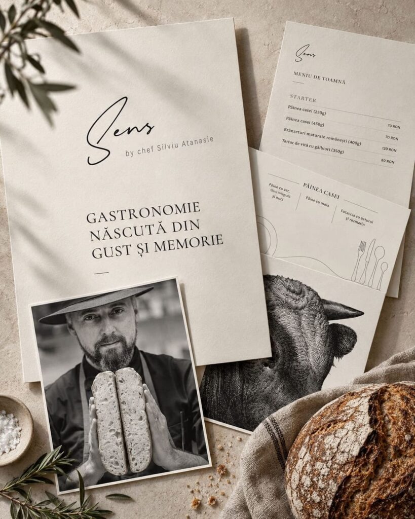
Silviu Atanasie — personal identity and gastronomic project
The starting point was the relationship between a chef's professional identity and the public expression of his gastronomic project. The experience, the craft and the vision were already there; what was needed was a brand form that would bring them together and make them recognisable.
The Astro Branding process brought a few essential reference points to the fore. In the elemental reading, Earth provided the foundation — craft, continuity, simplicity and a direct relationship with the ingredients — while Water brought attention to sensory memory, relationship and the experience created around the table.
Changing the name from "Gallo Bistro" to "SENS" was not merely an image intervention. The new name and logo were built so that the restaurant would become the gastronomic expression of the Silviu Atanasie personal brand. The visual identity follows the same logic of distillation: a clear, recognisable form capable of bringing together the sensory experience, the chef's vision and the idea behind the name "SENS" — cooking with meaning.
The name, logo, language and online presence were structured around three reference points: taste, memory, simplicity.
The result is an identity in which the person, the restaurant and the communication all support the same direction.
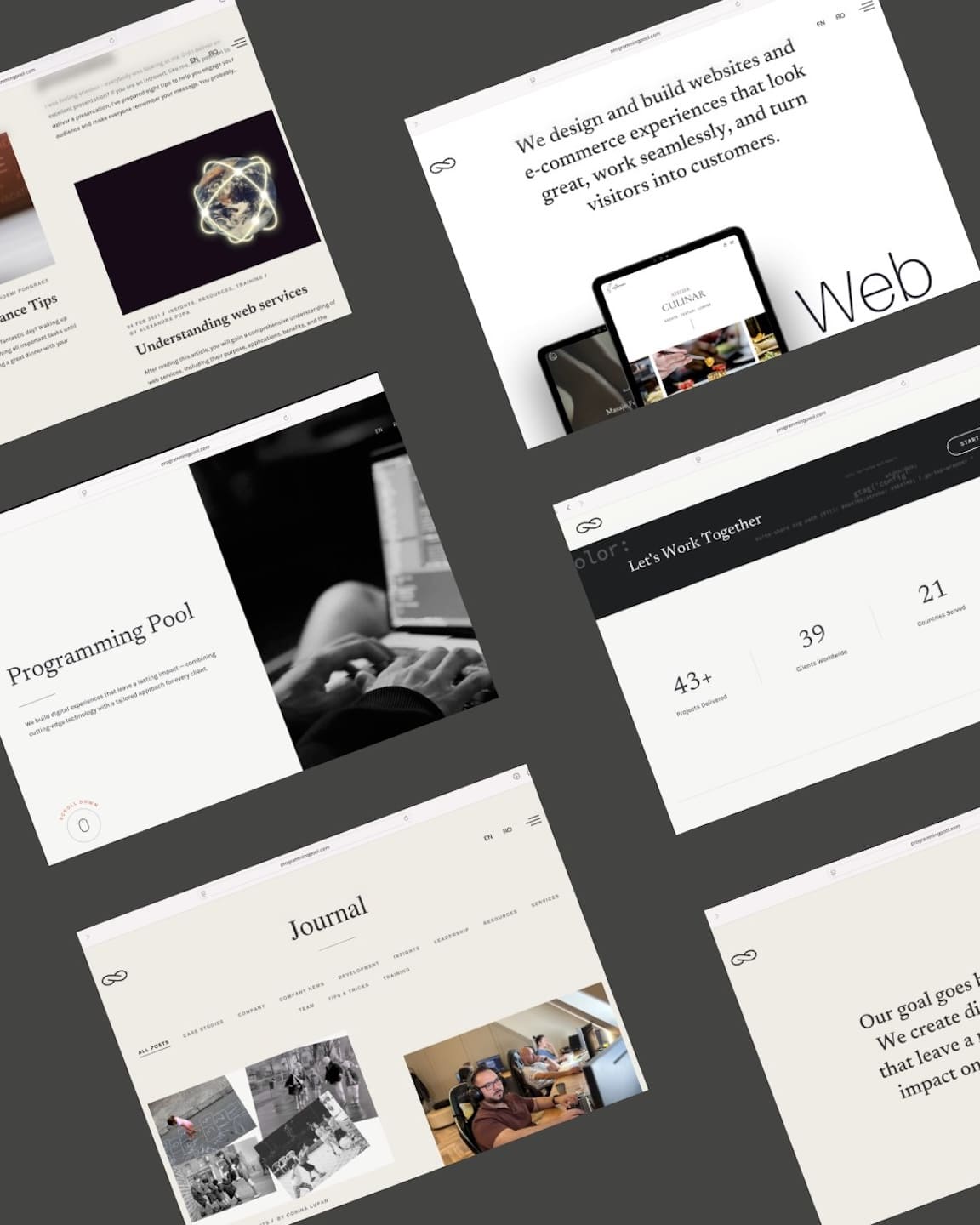
Programming Pool — positioning and brand architecture
Programming Pool had a solid professional track record and extensive experience in developing complex technology systems. Its public identity, however, did not sufficiently express the continuity, rigour and breadth of the relationships built over time.
The Astro Branding process examined the company's structure and its relationship with the direction set by its leadership. Earth highlighted the brand's foundation — precision, stability and the capacity to build over the long term — while Fire provided the reference point for a firmer expression of its vision and direction.
From this dynamic, a more precise positioning took shape: not just a service provider, but a long-term technical partner capable of building and sustaining complex infrastructures.
The logo translates this positioning into a simple, memorable sign. The two "Ps" in the name Programming Pool meet in a continuous form and together create the infinity symbol. The sign expresses continuity, collaboration and the capacity of systems and professional relationships to evolve over time.
The new direction gives the company a clearer language and creates the framework needed to present its own products, without losing the values that have supported its growth.